
Brand Guidelines
A set of simple guidelines to keep in mind when using the Flipboard logo.
For questions about the use of these brand assets contact guidelines@flipboard.com.
Downloads
Guidelines
1. The logo
The primary logo exists as a horizontal lockup, and this version should be used whenever possible. However, when horizontal width is a challenge, you can use the vertical version of the logo. Both can be found in the logos folder above.
These lockups are fixed, so please do not try to tweak or recreate the logo from it’s core elements.
![]()
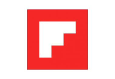
2. The logomark
Used primarily as an app icon, and on corporate communications, the logomark should only be used when there is a clear mention of the Flipboard brand name.

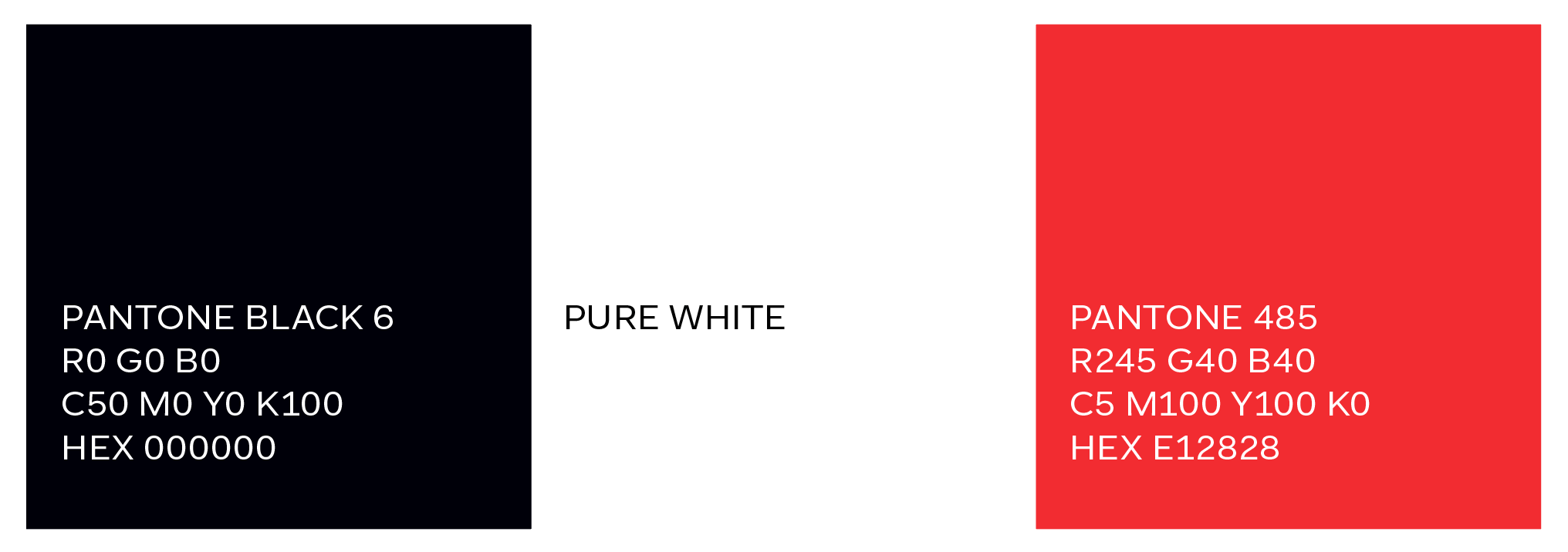
3. Colors
Below is a reference for the Flipboard color palette. You can also find this palette in the brand guidelines.
4. Sizing
The 1:5 rule:
For digital use, always use the logo at a dimension where the width and height of the logomark is equal to a multiple of 5. Produced at dimensions outside of this rule, the logo will alias.
Minimum sizes:
The minimum size that the logo appears on different devices is important to ensure legibility. For guidance on minimum sizing, please download refer to the brand guidelines at flip.it/logos.
5. Clear space
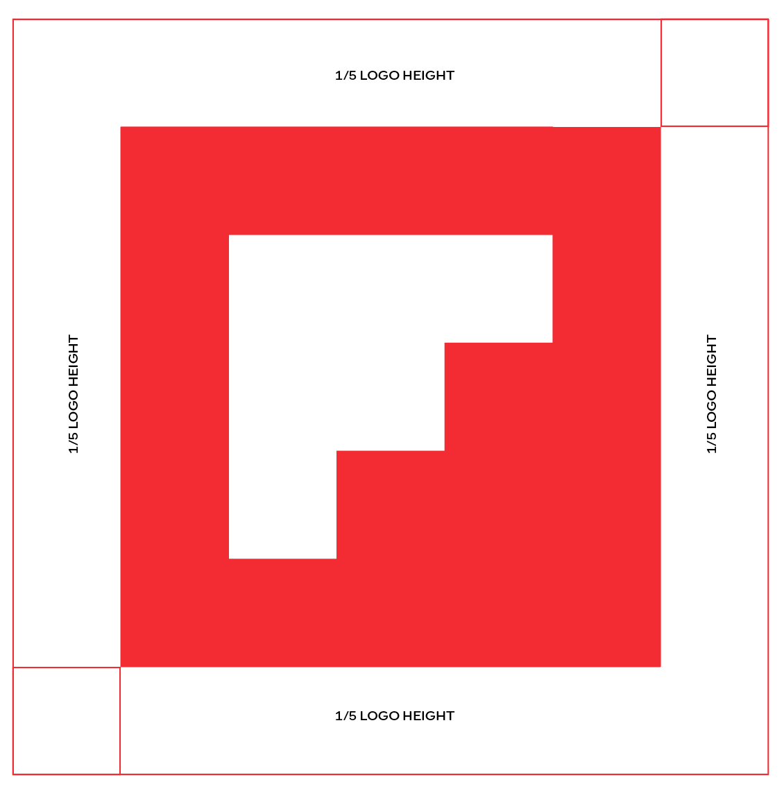
The clear space is the smallest distance allowed between the logo and any other graphic object; logo, physical or digital page edge, copy etc. Think of it as the logo’s comfort zone. The clear space should equal the width and height of the logo’s center square at its given size.